







You know the feeling when you wear an outfit and immediately receive compliments? People might remark on how your eyes pop, how radiant your skin looks, or simply exclaim, “That top is your color!” These are all indicators that the shade you’re wearing is harmonizing with your natural features. Your skin appears more even, your eyes sparkle, and there’s a general sense of ease to your appearance. This is the magic of dressing for your season.
Autumn color analysis is a specific category within the broader seasonal color analysis system. While every palette possesses unique nuances, official “Autumn” colors are generally characterized by warmth, richness, and grounded tones, ranging from muted sage and soft camel to rich rust and deep forest green.
Contrary to popular belief on social media, being an Autumn isn’t determined solely by your skin tone, eye color, or the appearance of your veins. Instead, it comes down to how color interacts with your features as a whole. Within the Autumn family, your most harmonious palette may be Soft Autumn, True or Warm Autumn, or Dark or Deep Autumn.
Below, we break down the differences among these sub-categories and share practical ways to integrate your best colors into your wardrobe, makeup routine, and everyday style.
What Is Autumn Color Analysis?
Seasonal color analysis organizes colors according to four primary characteristics:
- Temperature: Warm or cool
- Value: Light or deep
- Chroma: Bright or muted
- Contrast: The degree of difference among your features
To ensure this guide reflects a professional approach to color analysis, we consulted sisters Hannah and Sophia Rashad, co-founders of Curate Your Style, a Mayfair-based styling studio, and personal favorites in the world of color analysis.


Hannah and Sophia Rashad are sisters and co-founders of Curate Your Style, a Mayfair-based personal styling studio. Since 2021, Curate Your Style has worked with more than 30,000 clients across 116 countries and collaborated with fashion and beauty brands including Harrods, Fendi, Chloé, and Prada Beauty.
“The Autumn family colors are earth-toned, reflecting what you see in nature between the months of September through November,” Hannah and Sophia explain. Although the entire Autumn family is considered warm, its temperature can shift from neutral-warm to very warm depending on the specific sub-season.
Autumn colors generally sit within a medium-to-deep value range. Their chroma can move from muted and understated to medium and rich, but never extremely bright or neon.
How to Tell if You Might Be an Autumn
Traditional color advice often relies on oversimplified physical markers: green veins indicate warm undertones, fair skin means cool undertones, and olive skin automatically signifies warmth. According to Hannah and Sophia, these assumptions are among the most common reasons people are mistyped.
“One feature on its own will never give you the answer.”
The surface color of your skin—its overtone—is not the same as its undertone. Fair skin can have a warm undertone, while olive skin may be warm, cool, or neutral. Deep skin isn’t automatically cool, and tanning isn’t evidence that someone belongs to a warm season.
The popular vein test is also inconclusive on its own and can be particularly unreliable on deeper skin tones.
“A color analysis reads three key qualities about your coloring together: the temperature of your undertone, hair, and eyes; how light or dark your features are; and how bright, rich, or muted your features appear against your skin,” Hannah and Sophia explain. “One feature on its own will never give you the answer.”
How to Experiment With Color Draping at Home
If you want to explore whether you might fall within the Autumn family, Hannah and Sophia recommend starting with three drapes: olive green, warm chocolate brown, and beige. All three contain a significant amount of yellow, which tends to harmonize with Autumn coloring. Place each color directly beneath your face in indirect natural light, and look at your face—not the fabric.
A harmonious color should bring attention to your eyes and smile while helping your complexion appear clearer. A less harmonious color may pull attention away from your features or make your complexion appear sallow or uneven.
You can also test pure black, pure white, pastels, and neon colors, which tend to be less harmonious with Autumn coloring. If these shades overpower your features while olive, chocolate, and beige allow you to come forward, Autumn may be worth exploring further.
For the clearest comparison:
- Remove heavy makeup and self-tanner.
- Use indirect natural light beside a window or outdoors.
- Stay out of direct sunlight, which can distort depth and contrast.
- Turn off your camera’s flash and filters.
- Use your natural hair color as the reference point.
If your hair is dyed, pull it away from your face and find a clear photo of your natural color—even a childhood photo can help. Dyeing your hair does not change your season. A True Autumn who dyes her hair jet black, for example, does not become a Dark Winter.
At-home draping can point you in the right direction, but lighting, color selection, camera settings, and personal bias can all influence what you see. A professional analysis provides a more controlled and objective comparison.
The 3 Sub-Categories of the Autumn Color Analysis Palette
Soft Autumn, True Autumn, and Dark Autumn all share warmth, but their dominant characteristics set them apart. Soft Autumn is the most muted, True Autumn is the warmest, and Dark Autumn is the deepest.
Every Autumn sub-season can appear across a wide range of skin tones. Hannah and Sophia point to Devon Aoki, Adele, and Tyra Banks as examples of Soft Autumn; Beyoncé and Lindsay Lohan as True Autumn; and Victoria Beckham, Jasmine Tookes, and Zendaya as Dark Autumn.
Within each group, the women have very different skin depths and features. What they share is the relationship among temperature, value, and chroma—not a specific ethnicity or complexion.
The Soft Autumn Color Palette


Picture the Soft Autumn palette during the gentle transition from summer to fall. The colors are warm, but they’ve been softened: sage instead of emerald, dusty rose instead of hot pink, warm taupe instead of stark gray.
Soft Autumn is defined primarily by its muted quality. Its colors are understated and quiet, and its features tend to blend softly with the skin rather than appearing striking against it. If vivid color tends to appear before you do, but softly warmed shades bring your features into focus, this may be your palette.
Best Colors for Soft Autumn
Neutrals include oatmeal, mushroom, warm taupe, soft camel, cocoa, ecru, and muted navy—an easy foundation that offers warmth without too much contrast.
For accents, look to sage green, artichoke, dusty teal, muted terracotta, soft mustard, warm rose, salmon, and faded brick red. The palette has an almost vintage quality: warm and earthy, but gently weathered.
Optic white, jet black, icy pastels, and highly saturated jewel tones can feel disconnected from Soft Autumn’s blended quality. That doesn’t mean you can never wear them—try moving a less harmonious color away from your face, or softening it with one of your better neutrals.
Soft Autumn Outfit Formulas
Because Soft Autumn’s features and colors are naturally blended, lower-contrast combinations work beautifully. Hannah and Sophia recommend pairing a sand-beige knit with an artichoke-green jacket and muted brown denim—the key is choosing colors that feel understated and quiet rather than loud.
Other combinations to try:
- Pair a warm taupe knit with ecru denim and a muted olive jacket.
- Style a dusty teal blouse with chocolate trousers and brushed-gold jewelry.
- Layer a soft camel coat over a warm rose top and medium-wash denim.
- Wear tonal shades of oatmeal, mushroom, and cocoa.
Texture reinforces the palette’s gentle quality—washed linen, suede, soft denim, brushed knits, and matte leather all feel at home here.
Best Metals for Soft Autumn
Hammered or brushed finishes rather than highly polished metal. Soft yellow gold, copper, bronze, and mixed metals with a matte or gently weathered finish complement the palette’s quiet warmth. Amber, carnelian, smoky quartz, and muted green stones echo its earthy colors.
Soft Autumn Makeup Colors
For lips, warm rose, muted coral, soft brick, or peachy nude. Blush might include apricot, warm rose, or muted terracotta, depending on your skin tone. On the eyes, taupe, olive, bronze, cocoa, and softly smoked brown, rather than icy gray or high-contrast black.
These color families will appear differently across complexions, so consider the depth of the shade as well as its undertone. A “nude” lip, for example, should relate to your natural lip and skin depth rather than one universal beige.
For nails: muted rose, mushroom, warm taupe, soft terracotta, and sage.
A Soft Autumn wardrobe begins with warm, gently muted colors and tactile materials—mushroom and taupe knits, soft camel suede, warm rose, ecru denim, muted brown leather, and softly finished gold.
The True Autumn Color Palette
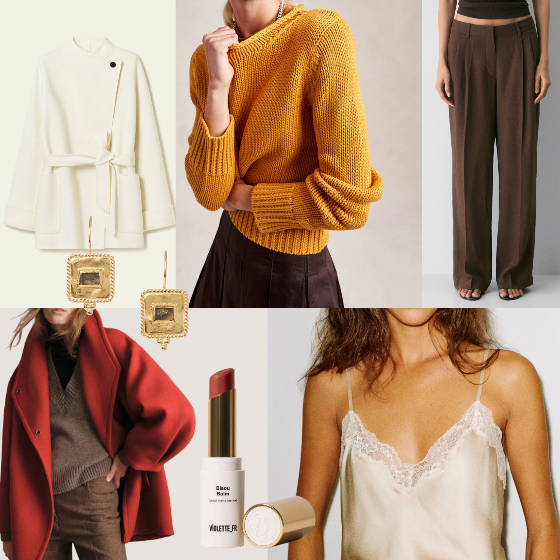
The True Autumn palette lands right in the middle of autumn’s peak richness. Its colors recall leaves fully transitioned to gold and rust, olive branches, warm spices, and sunbaked terracotta.
Also known as Warm Autumn, True Autumn is defined primarily by temperature. These colors represent the quintessential Autumn season and tend to suit people whose natural coloring is extremely warm. The palette has medium value and rich—but never bright—color.
Best Colors for True Autumn
Neutrals include warm beige, camel, cognac, chocolate, olive, and deep warm navy. Instead of stark white, try ivory or buttercream. Instead of cool gray, try mushroom brown or khaki.
This palette comes alive in mustard, ochre, rust, paprika, tomato red, moss green, warm teal, and deep coral. No season wears orange quite like True Autumn, but the most harmonious versions feel rich and organic rather than fluorescent.
Icy pastels, blue-based pinks, optic white, neon colors, and cool gray may feel at odds with the palette’s unmistakable warmth. If you love them, introduce them through accessories or pair them with a warmer color near your face.
True Autumn Outfit Formulas
True Autumn can comfortably combine several rich colors without becoming overwhelmed. Hannah and Sophia suggest an olive-green top with warm chocolate trousers, a beige trench coat, and gold jewelry or accessories—warm and earthy rather than bright, which is more characteristic of Spring.
Other combinations to try:
- Pair a warm cream sweater with rust trousers and cognac accessories.
- Wear an olive jacket over warm denim with a mustard knit.
- Style a tomato-red blouse with a camel skirt and gold jewelry.
- Combine warm teal with chocolate brown for a colorful but grounded alternative to black and navy.
True Autumn is especially suited to classic fall materials: suede, corduroy, leather, wool, and nubby knits bring out the palette’s warmth and richness.
Best Metals for True Autumn
Yellow gold, brass, bronze, and copper. Antique and hammered finishes reinforce the palette’s organic richness, though polished gold can work when you want a brighter effect. Amber, tiger’s eye, topaz, and jasper naturally echo True Autumn’s warm browns, oranges, and golds.
True Autumn Makeup Colors
For lips: warm brick, spiced coral, terracotta, tomato red, or a peachy brown nude. Blush can lean apricot, warm peach, cinnamon, or terracotta, adjusted to your complexion’s depth.
Olive, bronze, copper, warm brown, and muted gold work beautifully around the eyes. A chocolate or deep brown liner offers definition without the cooler effect of blue-black.
For nails: rust, moss green, warm red, cinnamon, chocolate, or burnished gold.
Build the palette around unmistakably warm shades such as mustard, burnt orange, warm beige, chocolate, olive, and rich teal—steering clear of anything icy, neon, or jewel-bright.
The Dark Autumn Color Palette
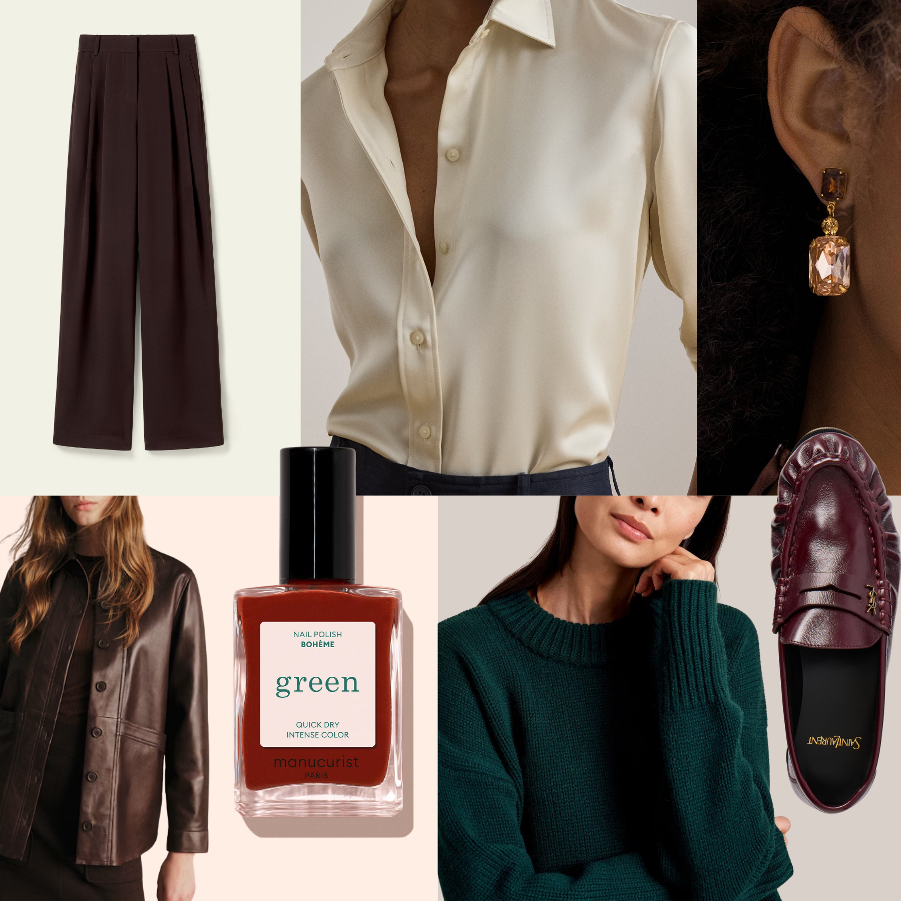
Imagine the Dark Autumn palette at the end of the season, when the colors become deeper and more dramatic. Forest green, aubergine, oxblood, deep teal, and espresso replace the softer shades found earlier in the Autumn spectrum.
Also known as Deep Autumn, Dark Autumn is defined first by depth and then by warmth. Its colors are the darkest of the Autumn family and tend to harmonize with people whose natural hair and eyes contribute noticeable depth to their overall coloring.
That doesn’t mean someone needs a particular skin depth to be Dark Autumn—fair, medium, olive, and deep complexions can all appear within this sub-season.
Best Colors for Dark Autumn
Neutrals include espresso, dark chocolate, deep olive, warm charcoal, cognac, and rich beige. While jet black may appear harsher than a warmer dark neutral, Dark Autumn can often wear colors that approach black—especially when their underlying warmth remains visible.
Accent colors include forest green, aubergine, oxblood, deep teal, peacock blue, dark rust, warm burgundy, and saturated moss. These colors have presence, but they aren’t bright—their impact comes from richness and depth.
Pale icy colors, cool pastels, and head-to-toe light shades can feel disconnected from Dark Autumn’s depth. Try anchoring a lighter neutral with espresso, deep olive, maroon, or another strong color from the palette.
Dark Autumn Outfit Formulas
Dark Autumn is especially suited to rich tonal combinations. Hannah and Sophia recommend a maroon knit with an espresso-brown skirt and dark-gold jewelry or accessories—antique metal finishes rather than highly polished or brushed ones, to reinforce the palette’s depth.
Other combinations to try:
- Pair an espresso knit with deep olive trousers and an oxblood bag.
- Wear a deep teal dress with antique-gold jewelry.
- Layer a warm charcoal blazer over an aubergine top and dark denim.
- Style a rich beige blouse with chocolate trousers and a forest-green jacket.
Rather than defaulting to black, use espresso, warm charcoal, dark olive, and ink-like teal as the anchors of your wardrobe—nearly the same versatility, while connecting more naturally to the rest of the palette.
Best Metals for Dark Autumn
Dark gold, antique brass, bronze, copper, and deeper mixed metals with an aged rather than highly polished or brushed finish. Garnet, smoky quartz, amber, tiger’s eye, and deep green stones complement the palette’s warmth and depth.
Dark Autumn Makeup Colors
For lips: oxblood, warm burgundy, deep brick, raisin, or rich brown-red. Depending on your complexion, blush may range from warm terracotta and spiced rose to deeper cinnamon and red-brown shades.
For the eyes: espresso, bronze, deep olive, aubergine, dark teal, and antique gold offer definition while remaining connected to the palette. Black eyeliner can create a more dramatic effect, but espresso or deep brown may feel more integrated for everyday wear.
Deep red, chocolate, forest green, aubergine, and warm burgundy make striking nail colors.
Choose pieces with noticeable depth: espresso and chocolate brown, forest green, aubergine, oxblood, maroon, and antique gold. The goal isn’t a wardrobe of almost-black clothing, but a rich palette in which every color carries visual weight.
How to Use Your Autumn Palette Without Replacing Your Wardrobe
Discovering your color season can make you want to reevaluate everything in your closet. But there’s no need to clear out every item that falls outside your palette.
Hannah and Sophia recommend wearing your specific sub-season most of the time, particularly when choosing hair color, makeup, and clothing worn close to the face. But borrowing from a neighboring season is common, since two palettes often share certain properties—a Dark Autumn, for example, may borrow selectively from True Autumn or Dark Winter.
“The important thing is to introduce your colors gradually, and start wearing colours from your palette that you genuinely like.”
The easiest approach is to introduce your palette gradually. Start with tops, sweaters, scarves, earrings, and makeup—the colors closest to your face tend to have the greatest effect. Pants, skirts, shoes, and bags give you more flexibility.
Most importantly, begin with colors from your palette that you genuinely like. As Hannah and Sophia put it: “Forcing yourself into a palette is the fastest way to fall out of love with it and abandon color analysis altogether.”
If you love a color outside your palette, consider:
- Wearing it on the bottom half of your outfit.
- Layering one of your best colors near your face.
- Choosing a print that includes both colors.
- Adjusting the shade rather than abandoning the color entirely.
- Wearing it anyway because it makes you happy.
Color analysis should make getting dressed easier, not more restrictive.
Autumn Color Analysis FAQs
Can you be an Autumn if you have olive skin?
Yes. Olive describes the surface appearance of the complexion rather than a complete seasonal palette. Olive skin can have warm, cool, or neutral undertones and may appear across multiple seasons. Comparing how colors interact with your complete natural coloring is more useful than assigning a season based on the word “olive” alone.
Can you be an Autumn with dark skin?
Yes. Every Autumn sub-season spans fair to deep skin tones. Darker skin does not automatically indicate Dark Autumn, just as fair skin does not automatically indicate a cool season. Temperature, value, and chroma must be considered together.
Can you be an Autumn with blonde, gray, or black hair?
Potentially. Hair color alone cannot determine or rule out a season, but natural hair is one part of the complete analysis. The analyst considers its temperature, value, and chroma alongside the skin and eyes.
Should I use my natural or dyed hair color?
Use your natural hair color as the reference point. If your hair is currently dyed, pull it away from your face and find a clear photograph of your natural color. Even childhood photographs can help. Hair dye can clash with your palette, but it does not change your underlying season.
What if I’m between two Autumn sub-seasons?
Neighboring palettes naturally share certain properties, and borrowing from them is common. Still, your own sub-season generally produces the most harmonious effect, particularly for hair, makeup, and clothing near your face.
Instead of trying to combine two labels, identify the dominant quality in your coloring—softness, warmth, or depth—and use your own palette most of the time.
Can an Autumn wear black?
Of course. If pure black feels harsh near your face, try espresso, warm charcoal, deep olive, or dark chocolate for a similar effect. You can also soften black with an Autumn-colored scarf, sweater, jacket, jewelry, or makeup.
Can I do color analysis at home?
At-home draping can help you observe broad patterns and narrow your possibilities. For the best result, use indirect natural light, remove heavy makeup and self-tanner, reference your natural hair color, and turn off camera flash and filters.
The hardest part may be setting aside your existing preferences. Hannah and Sophia often see people recognize disharmonious colors easily on their friends but struggle to see the same effect on themselves—especially when they feel emotionally attached to a particular color or hoped for a specific result.
A professional analyst offers an unbiased eye and understands how to separate temperature, value, and chroma—qualities that can be difficult to distinguish without training.
The Final Takeaway
Your most flattering colors are often the ones that allow people to see you first. For Autumns, those shades share a sense of warmth and richness—but the right version might be softly muted, unmistakably golden, or beautifully deep.
Start with a few colors you’re naturally drawn to and introduce your palette gradually. Try them near your face, notice what happens, and use your season as a practical guide. The best wardrobe isn’t one that follows every recommendation perfectly. It’s the one that makes getting dressed feel easier—and a lot more like you.


